A funnel chart demonstrates data flow through a linear, sequential process within a sales pipeline. They help readers quickly make sense of data and are often used by organizations to identify potential problems within a process. They also help organizations take quantified measurements of conversion, churn, and sales rates.
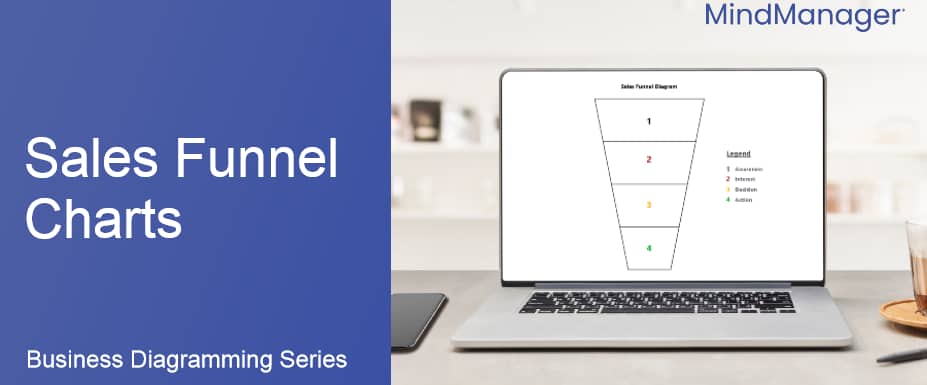
The chart gets its name from its shape – the top of the chart, known as 'the head,' is the intake stage of the funnel, which means that it is typically the broadest and has the highest number of participants being referenced in that stage of the funnel. The bottom of the chart, known as 'the neck,' is the narrowest part and has the lowest number of participants.
There are two different types of funnel charts:
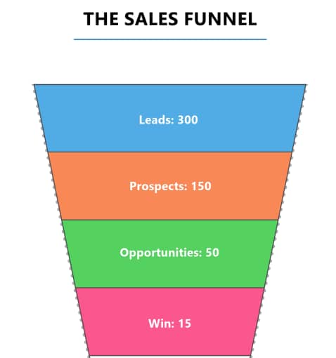
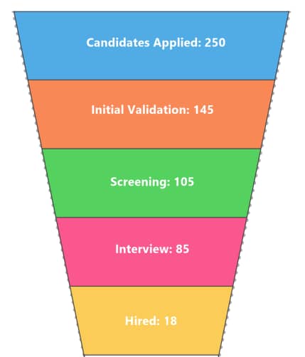
Trapezoidal funnel charts show values arranged on top of one another, with the smallest value at the bottom and the largest value at the top, arranged in horizontal sections in the form of a trapezium. A larger section indicates a larger value, so it is important to look at the size and width of each section.
Project type examples:
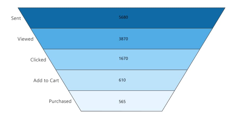
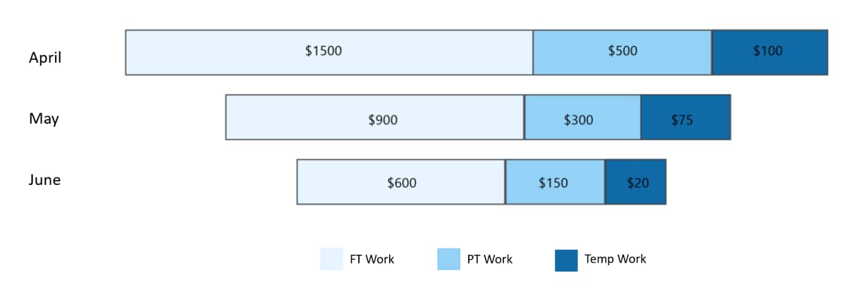
Stacked bar funnel charts show values arranged on top of one another, with the smallest value at the bottom and the largest value at the top, arranged in horizontal bars. A wider bar indicates a larger value.
Project type examples:
Funnel charts are usually seen in business or sales contexts where a set of consumers or users have a general flow or process that they follow through multiple stages. We have included some examples of when it may be appropriate to use a funnel chart within an organization:
Organizations can use funnel charts to calculate potential revenue, sales figures, and retention rates. These can then be compared to actual figures to assess whether the organization is on track to meet its targets.
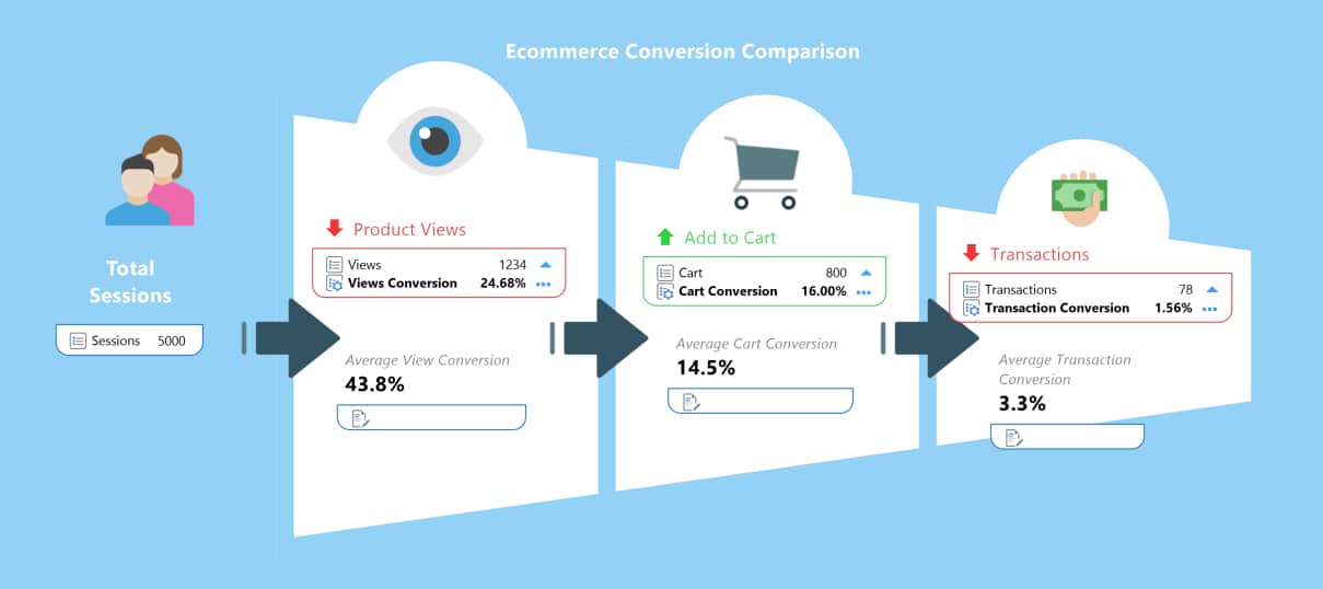
Funnel charts can be used to analyze conversion rates visually. For instance, a funnel chart for an email campaign can show the number of people who click through to the page, then the number of people who sign up, then the number of people who confirm their email address, and finally, the number of people who actually click the email and read it.
As well as analyzing conversion rates, organizations may also choose to use funnel charts to analyze their users' shopping cart workflow. For instance, while some users may head straight to the checkout after putting an item in their basket, it may be more common for users to put an item in their basket, browse some more items, remove some items from their cart, and put new items in their cart before checking out.
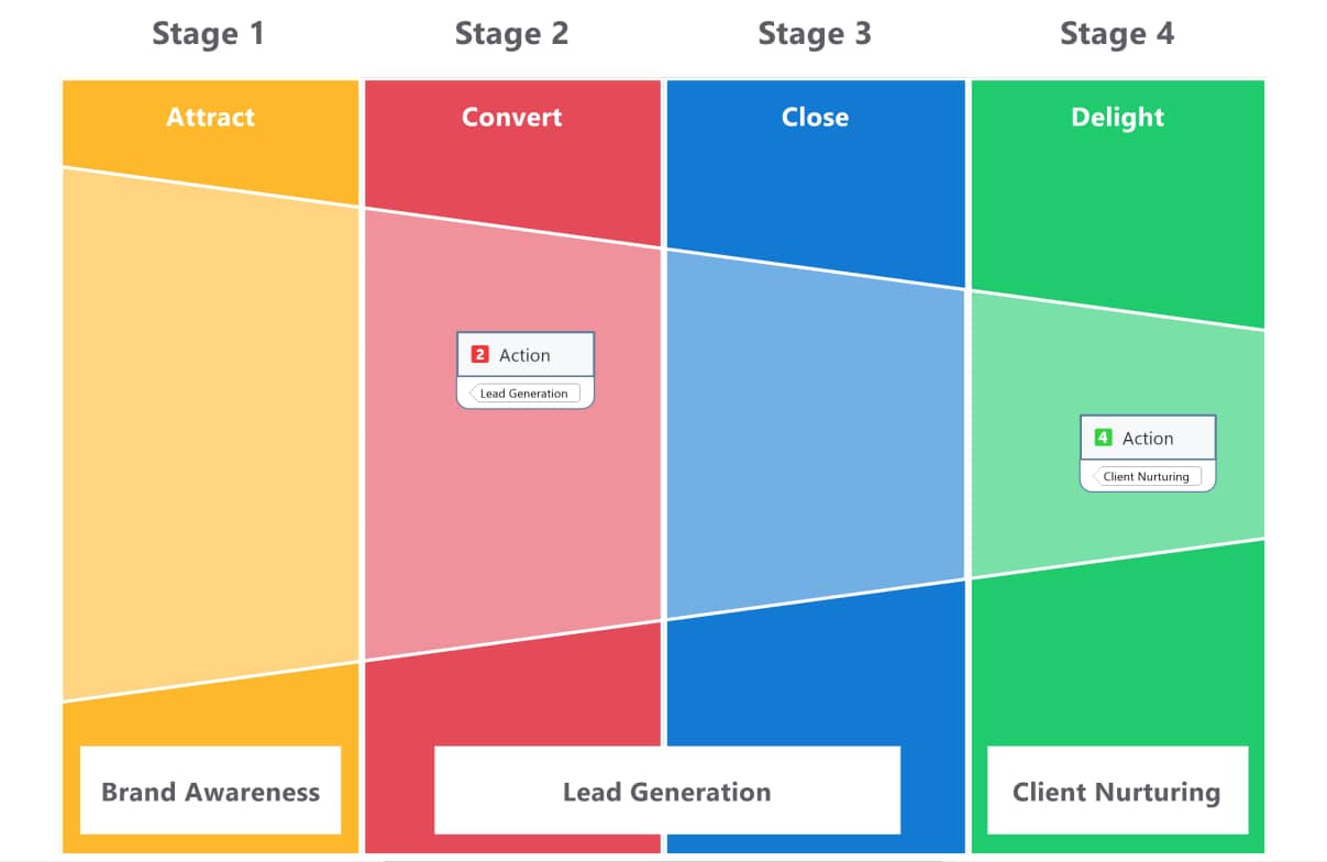
Funnel charts are often used to analyze the success of marketing campaigns. For instance, they can track the number of phone calls made or flyers posted to get a specific number of appointments, how many of these appointments turn into successful sales pitches, and how many sales are ultimately made. Organizations can then study each phase's results to assess their tactics' success.
Here are some of the benefits of using a funnel chart:
Funnel charts visualize data in a way that is easy for readers to understand quickly. Readers can scan a diagram instead of having to wade through paragraphs of text to determine whether there are any issues with a given process.
Simply looking at a funnel chart can clearly indicate whether a process is working well and where the bottlenecks are. For instance, if there is a significant drop between the 'add to cart' stage and 'purchase' stage in the funnel chart for an ecommerce store, then there is likely an issue that should be considered.
A funnel chart effectively summarizes large amounts of data so that organizations can identify patterns and bottlenecks within processes.
Funnel charts are often used to track the workflow of processes from start to finish to ensure that everything is being completed efficiently. For instance, an ecommerce store may track the flow of orders from the initial order stage to the delivery stage to ensure that they meet their packaging and delivery targets.
Organizations can use funnel charts to track and analyze important business metrics such as conversion rates. If there is a large drop-off at a particular stage of the process, the team can address it and determine what changes need to be made.
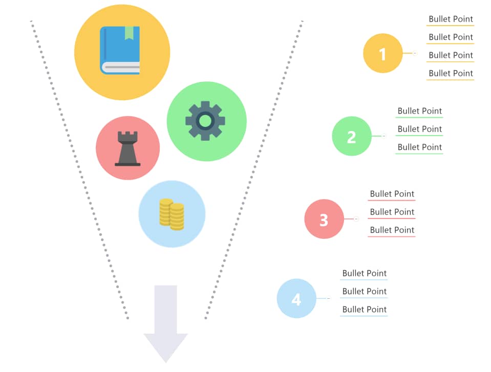
Here is a step-by-step guide to help you make a funnel chart:
MindManager, an industry-leading funnel chart software, allows you to create complex, detailed funnel charts with ease.
MindManager's key benefits include:
MindManager helps you synthesize ideas and information by providing a simple, intuitive framework for organizing your thoughts. With MindManager, you and your team can clarify complexity and collaborate in new and unexpected ways.
MindManager comes pre-installed with funnel chart templates. To use these templates:
A funnel chart shows data flow through a linear process within a pipeline.
A funnel chart can be used to calculate revenue, sales, and retention rates, analyze conversion rates, visualize a shopping cart workflow, and create advertising and marketing campaigns. It helps organizations summarize large amounts of data concisely, identify bottlenecks, and also parts of processes that are working well.
Funnel charts can be used to visualize the flow of data within your organization, track the workflow of processes, analyze important business metrics such as revenue, sales, and retention rates, and concisely summarize large amounts of data. This makes it easier to identify bottlenecks lowering your conversion rates and highlights parts of processes that are working well.
Ready to build a funnel chart? Try MindManager for free for 30 days and start building funnel charts right away with premade, customizable templates.